STEROID
Installation, Administration, Customization and User GuidesSTEROID
1.What is STEROID
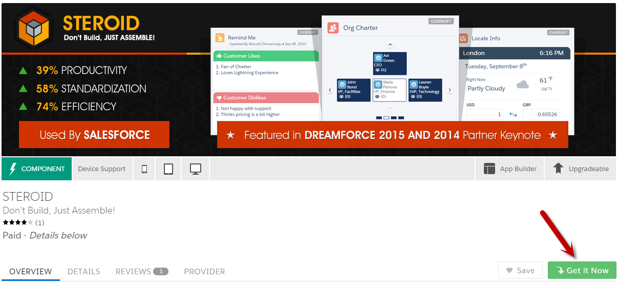
STEROID is the library of Lightning Components for Mobile & Desktops.

No Coding is needed, just Drag & Drop Steroid components in Lightning App Builder to quickly assemble Smart & Intelligent Apps.
Key Highlights –
Building Block & Composition Components
Google Maps with Custom Markers
Interactive Charts
Infinite Data Lists
Locale Intelligence
Organization and Hierarchy Charts
Sales Productivity
Support Productivity
2.STEROID Demo Video
STEROID was featured in Dreamforce Keynotes two years running (Dreamforce 2014 and 2015), and has been demoed by Salesforce regularly.
Dreamforce 2015 : Mr. Jim Sinai (Sr. Dir, App Cloud, Salesforce) presenting STEROID
Dreamforce 2014 : Mr. Ryan Ellis (VP, Product, Salesforce) presenting STEROID
3.STEROID Installation
Please have these Prerequisites completed before installing STEROID. Refer to Trailhead for more information.
- Enable Salesforce Lightning Experience
- Enable My Domain
- Enable ‘Lightning User’ permission
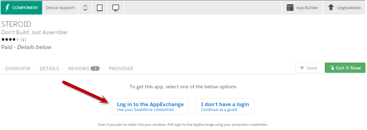
Navigate to Steroid Listing Page on Component Exchange and click ‘Get It Now‘ button.
Login with your AppExchange credentials
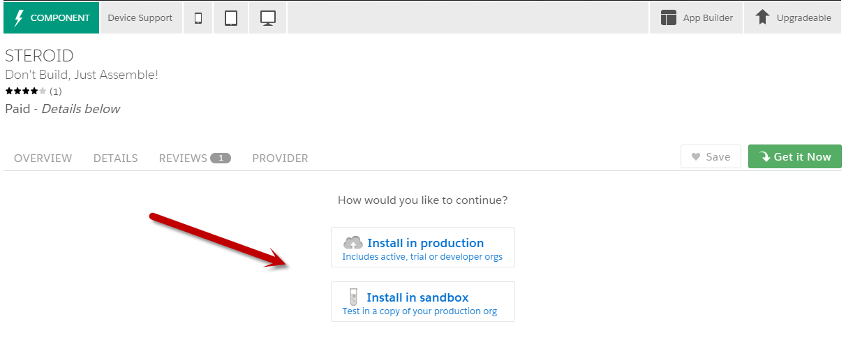
Choose the deployment organization (Production OR Sandbox)
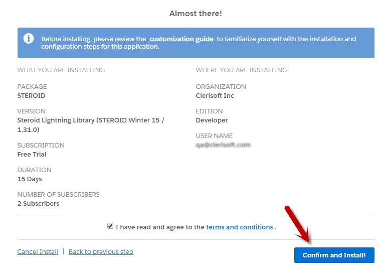
Accept terms and click Confirm and Install! button
Choose Install for All Users option and click Install button, wait for the installation to complete.
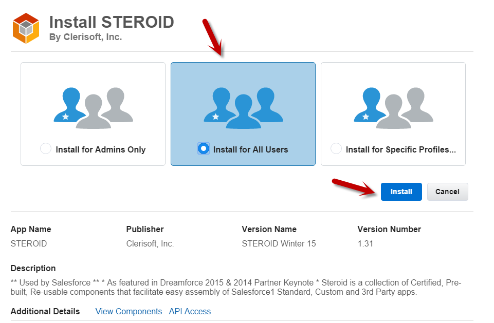
You have successfully installed STEROID.
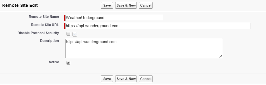
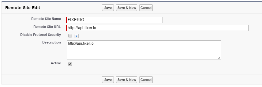
4.Post Install Configuration
1. Add 3 Remote Site Settings to enable Locale Info Component
5.Accessing STEROID
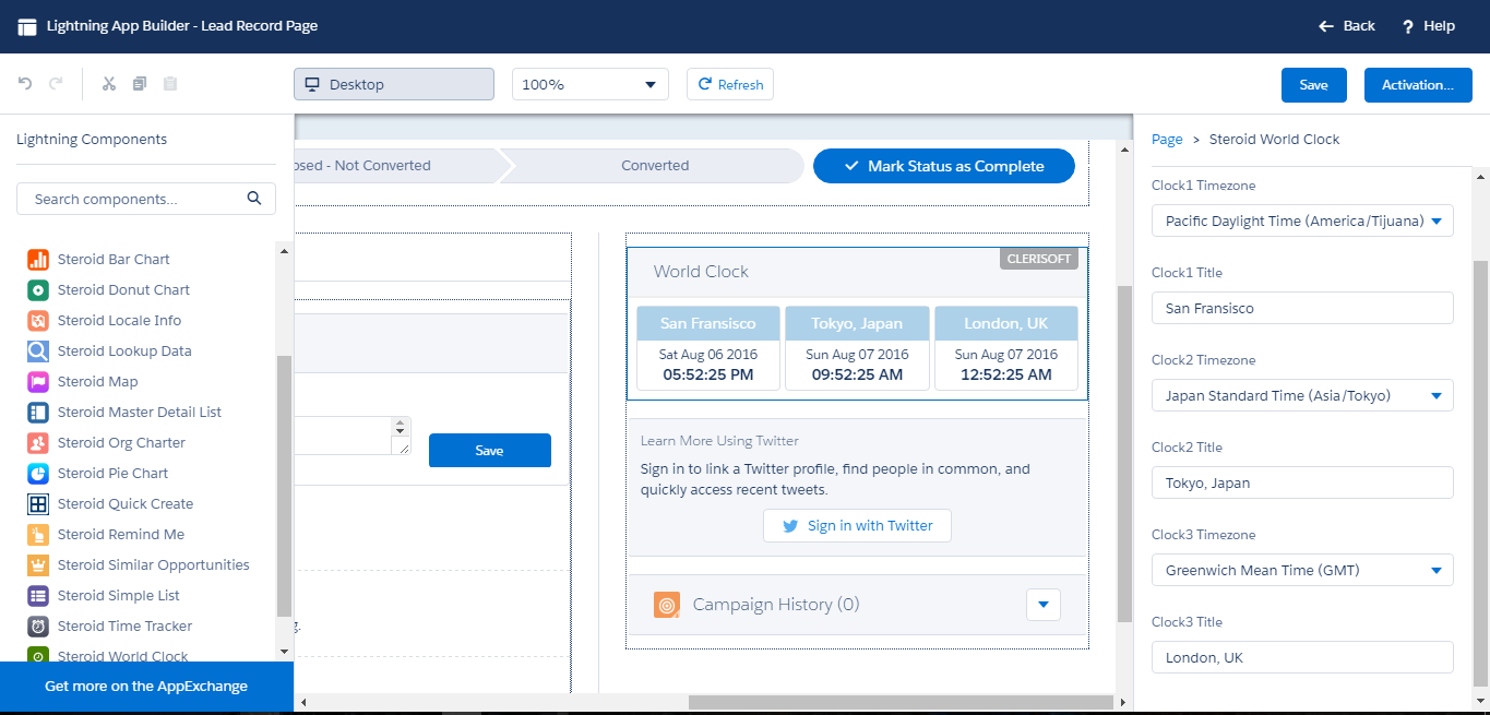
STEROID components are accessible from Lightning App Builder, which you can just Drag & Drop to quickly assemble apps.
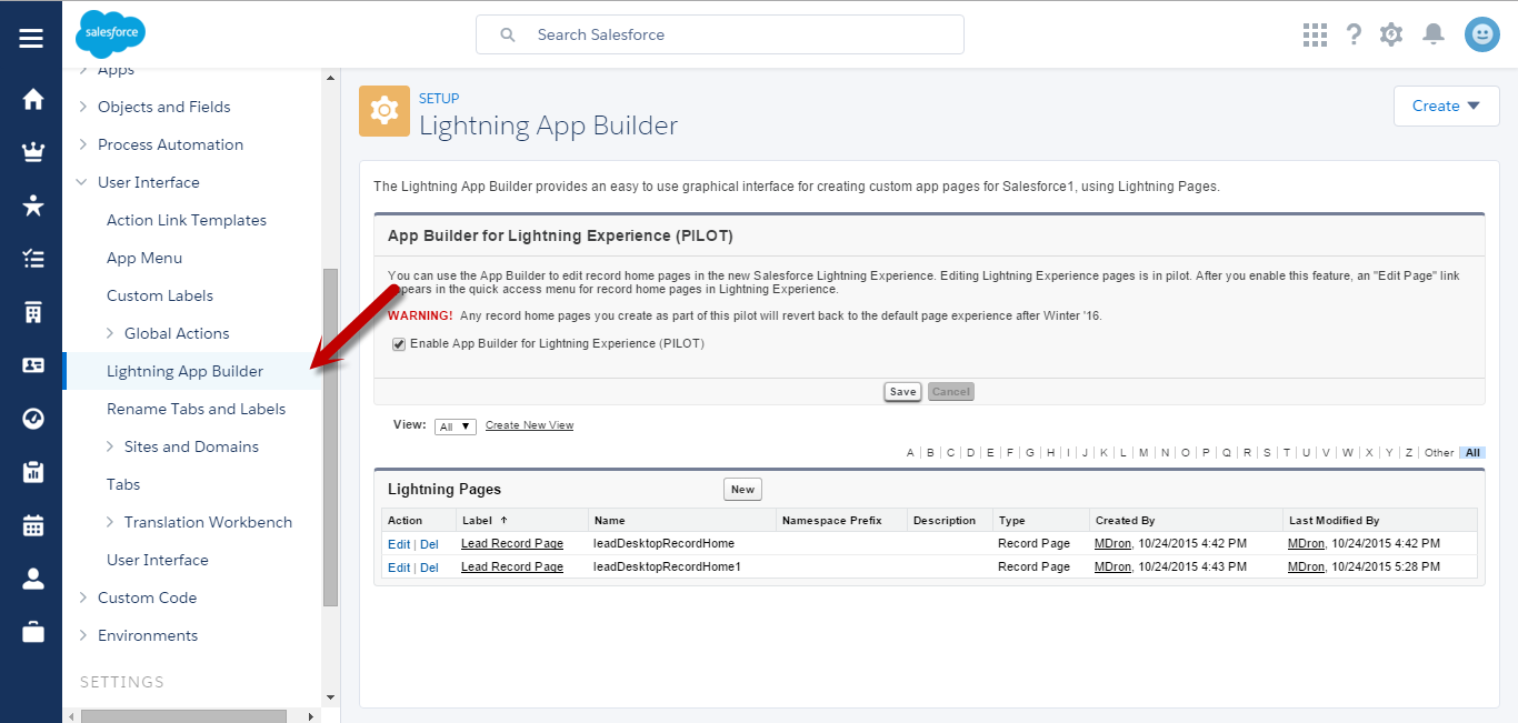
You can access Lightning App Builder in two ways
1. Lightning Experience : Record Details Page
Access Lead record details page and click Edit Page menu option
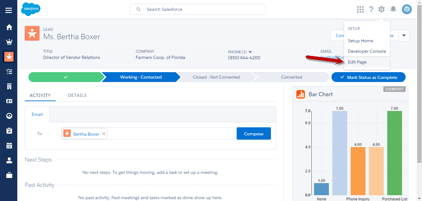
Now you can Drag & Drop STEROID components as you see fit.
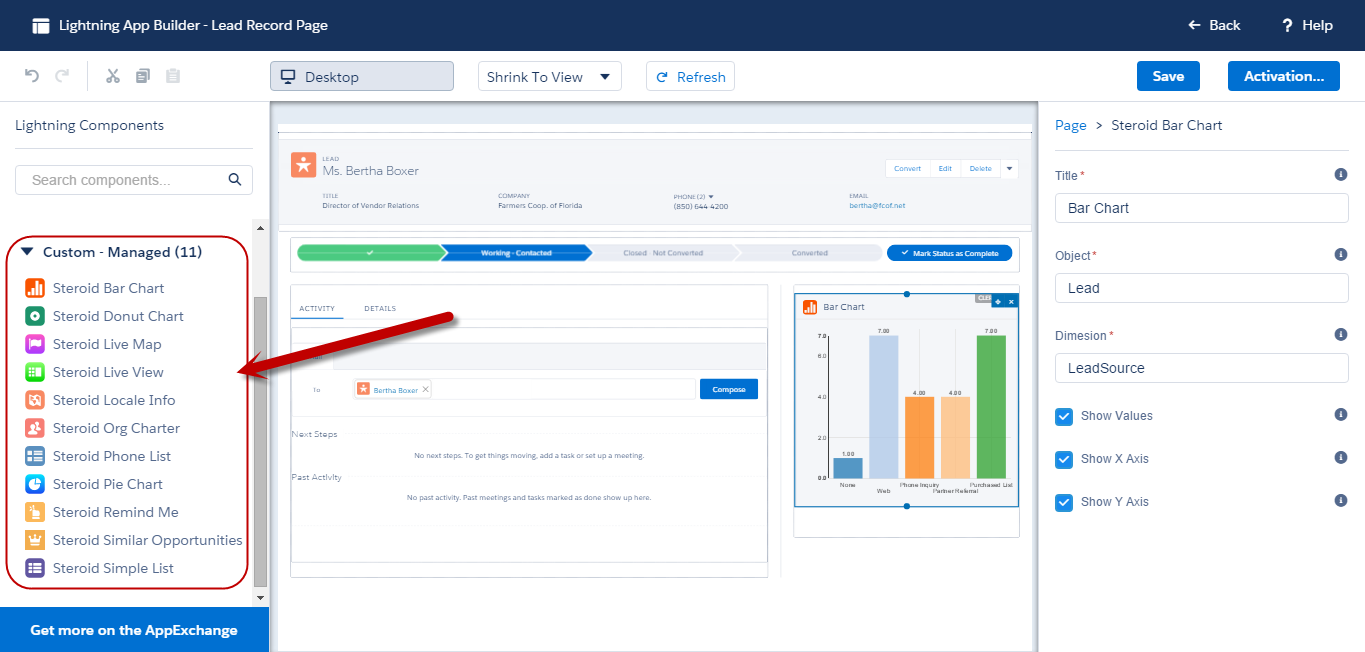
2. Standalone Mode : Lightning App Builder
You can access STEROID components from Lightning App Builder in a standalone mode
6.Smart Grid Technology
Smart Grid Technology is a great new feature we have introduced in STEROID recently.
Smart Grid Technology allows for Smart, Fluid yet complex grid layouts, which can be realized very easily.
STEROID components like Lookup Data and Quick Create relies on Smart Grid technology to layout fields in a wide variety of grid layouts.
Smart Grid Layouts are defined by a set of comma separated numbers like 2,2,2 OR 2,4,5,2 and so on.
Lets see a few Samples
Smart Grid Layout = 2,2,2 (Three rows with two cells each)
Smart Grid Layout = 2,4,5,2 (Four rows, row 1 with two cells, row 2 with four cells, row 3 with five cells and row 4 with two cells)
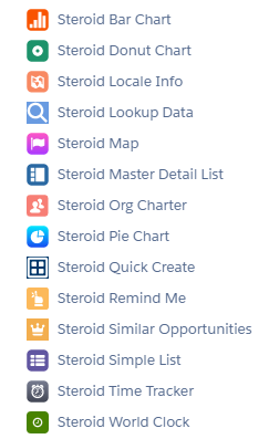
7.Component Reference
STEROID offers over a dozen amazing Lightning Components, and more components are being built in our labs. Please refer to individual component sections for additional information.
7.1.Bar Chart
Bar Chart Component facilitates plotting of aggregate data into a bar chart quickly. Bar Chart component provider finer controls to display Bar and Axis labels.
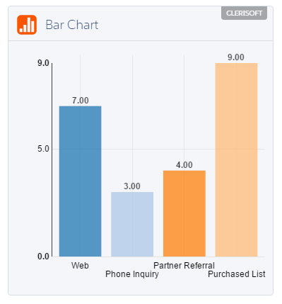
Bar Chart component supports a variety of properties for easier configurations. Identify proper attributes to quickly construct a Bar Chart for the desired data sets. The following is the list of supported properties for Bar Chart component.
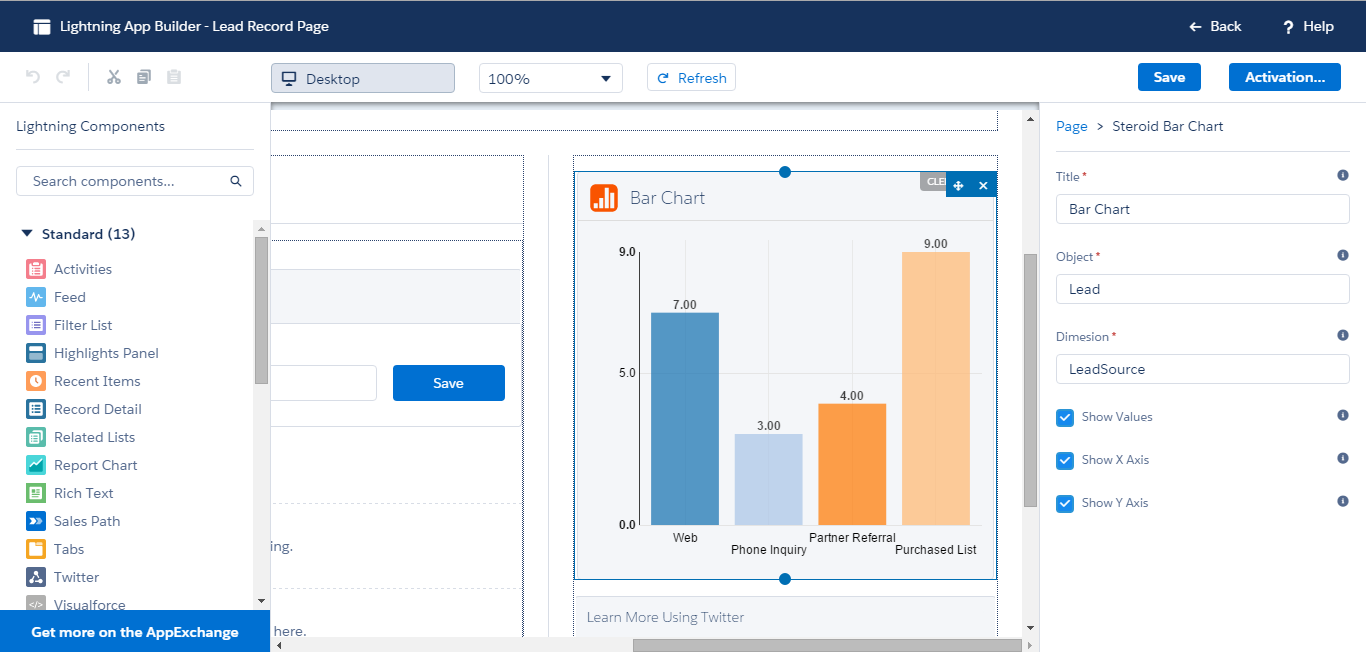
1. Title : Title for the Bar Chart (Ex: Leads By Source)
2. Object : Name of the object from which the chart is aggregated (Ex: Lead)
3. Dimension : The Aggregate property on the context object (Ex: LeadSource)
4. Show Values : Show the tool tip values for the bars in the chart (True/False)
5. Show X Axis : Show the labels for X Axis (True/False)
6. Show Y Axis : Show the labels for Y Axis (True/False)
7.2.Donut Chart
Donut Chart Component facilitates plotting of aggregate data into a donut chart quickly. Donut Chart component provider finer controls to display Legend and Chart Title labels.
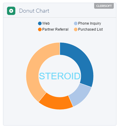
Donut Chart component supports a variety of properties for easier configurations. Identify proper attributes to quickly construct a Donut Chart for the desired data sets. The following is the list of supported properties for Donut Chart component.
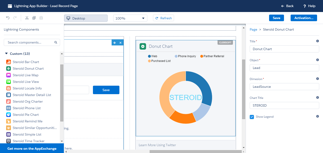
1. Title : Title for the Bar Chart (Ex: Leads By Source)
2. Object : Name of the object from which the chart is aggregated (Ex: Lead)
3. Dimension : The Aggregate property on the context object (Ex: LeadSource)
4. Chart Title : The title for the center section of the donut chart (Ex: STEROID)
5. Show Legend : Show the labels for X Axis (True/False)
7.3.Locale Info
Locale Info component quickly assembles location specific intelligence. Locale Info component takes advantage of the address fields to aggregate locale data.
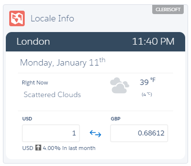
Locale Info component displays Weather and Currency information based on location. For regional locations, the currency segment is not displayed.
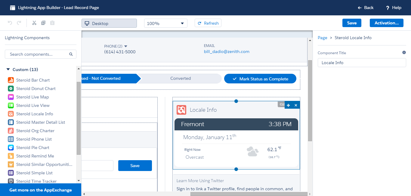
1. Title : Title for the component
7.4.Lookup Data
Lookup Data component displays data from a look up field. For instance, you could show Account information on a Contact Record.
Lookup Data component is based on Smart Grid Technology, which allows for fluid and complex grid layouts.
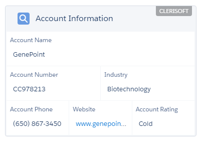
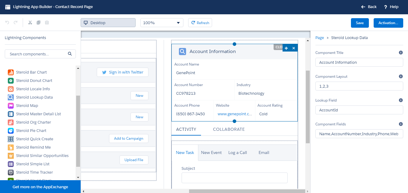
Lookup Data component has 4 properties
Component Title : Title for the component
Component Layout : Smart Grid Layout, a value of 1,2,3 results into 3 grid rows, with first row having 1 cell, second row having two cells and the third row having 3 cells. And the fields listed in ‘Component Fields’ gets distributed into these cells accordingly.
Lookup Field : The lookup field
Component Fields : Comma separated list of fields to be extracted from the lookup object
7.5.Map
Map component allows you plot any data set onto a google map. Map component gathers data from List Views and loads them onto google map. You will also be able to control the visibility of data sets and the radius markers accordingly. Please make sure to complete all Post-Install configurations before using Map component. Use the control bar presented at the left to be able to locate,plot and manage the data sets.

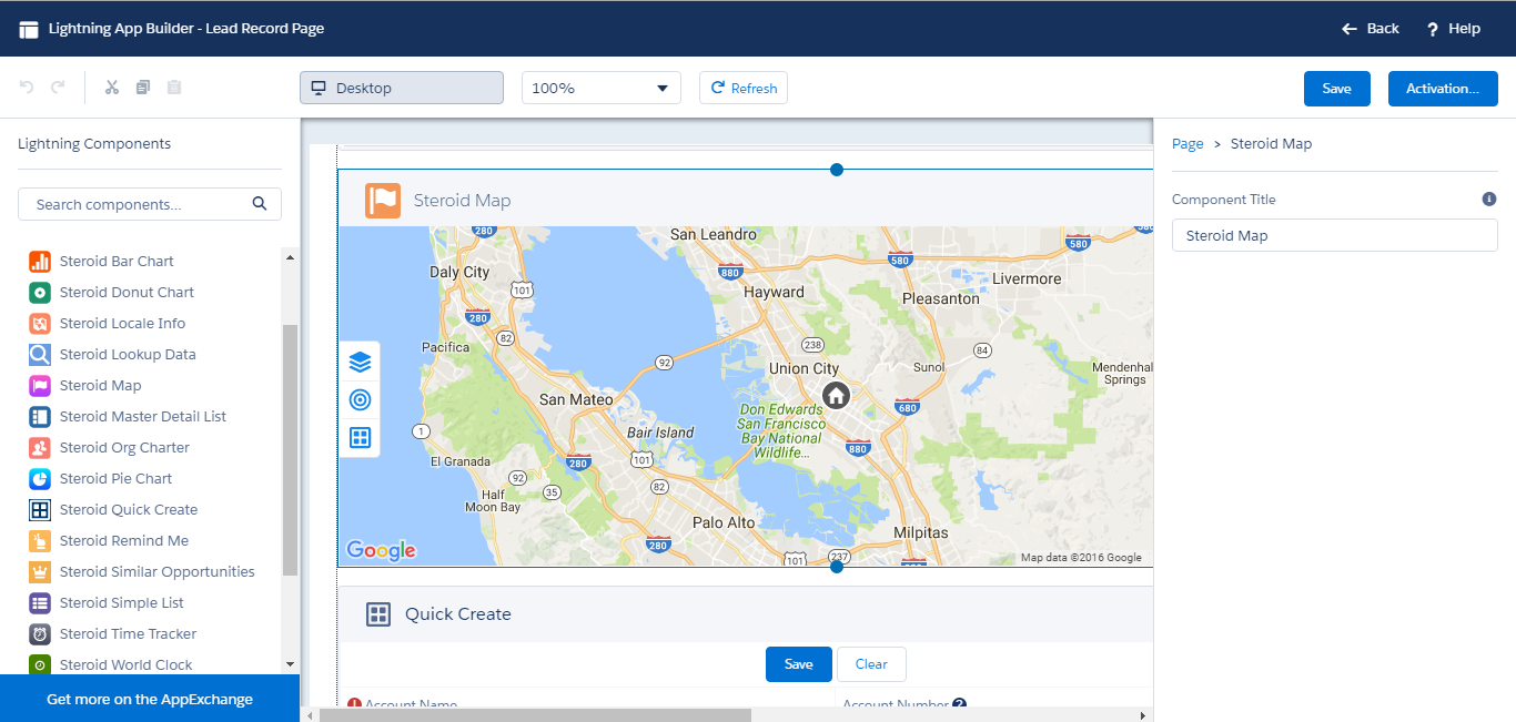
Map component has just one property, the title for the map.
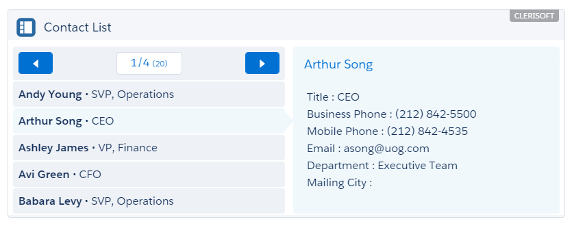
7.6.Master Detail List
Master Detail List component aggregates data into an intuitive split-view interface. Master Detail List component features pagination controls and allows for easy configurations.
Master Detail List supports a variety of properties for easier configurations. Identify proper attributes to quickly construct a Master Detail List for any Salesforce object. The following is the list of supported properties for Master Detail List component.
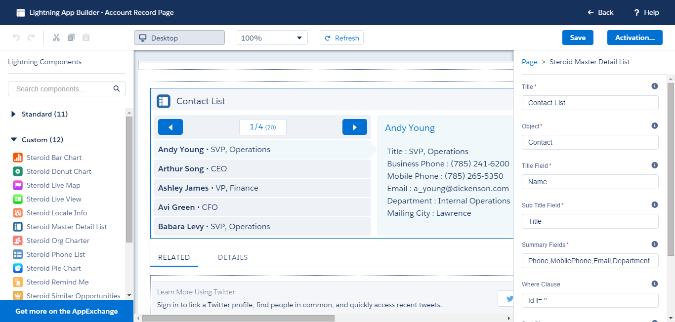
1. Title : Title for the Master Detail List (In this sample it is defined as Contact List)
2. Object : Name of the object for the list (In this sample it is defined as Contact)
3. Title Field : Name of the filed that would be listed as the title in the list view (left panel) (In this sample it is defined as Name)
4. Sub Title Field : Name of the filed that would be listed as the sub title in the list view (left panel) (In this sample it is defined as Title)
5. Summary Fields : Comma separated list of field names that would be displayed in the details view (right panel) (In this sample it is defined as Phone,MobilePhone,Email,Department,MailingCity)
6. Where Clause: Supply where clause to filter data (In this sample it is defined as Id!=”)
7. Sort Clause: Supply sort clause to apply default sort order of the data (In this sample it is defined as NAME ASC)
8. # of items per page: Define the page size (In this sample it is defined as 5)
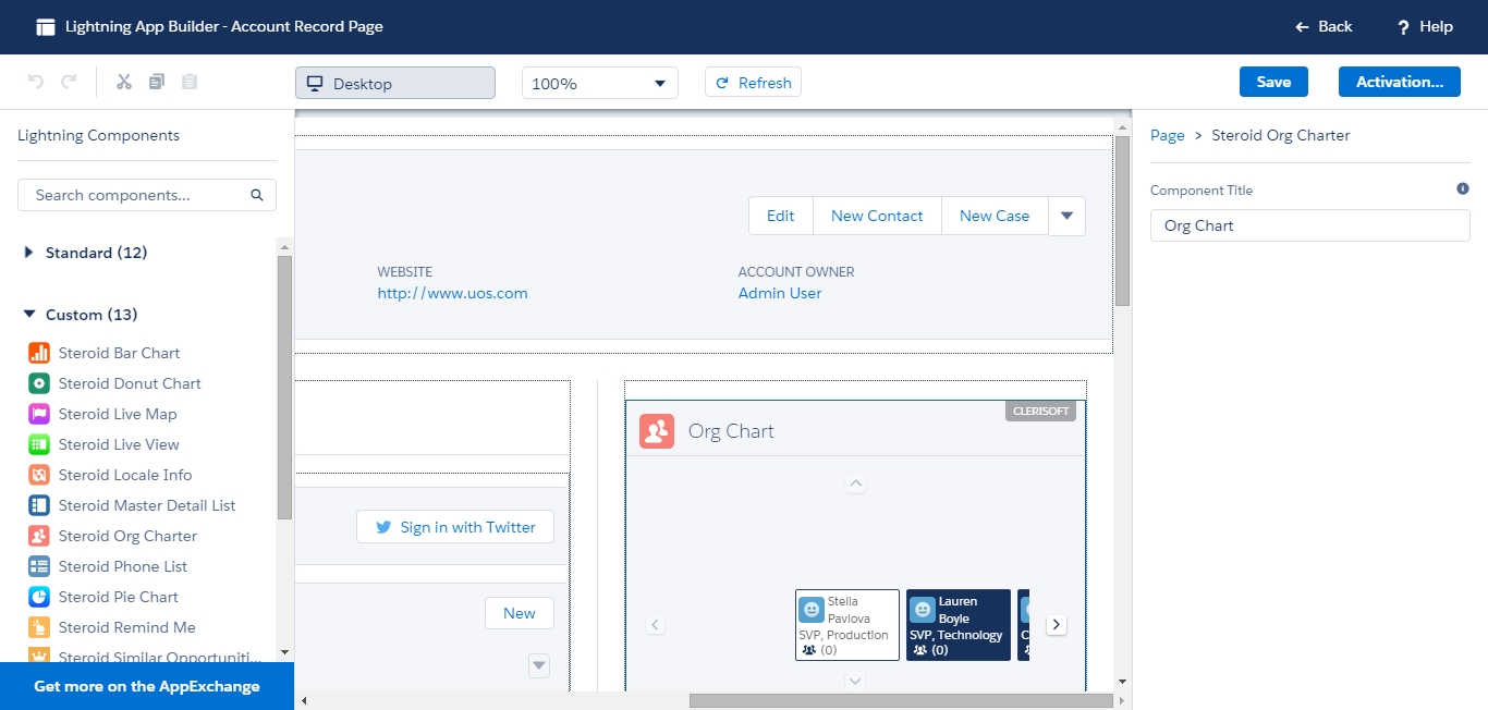
7.7.Org Charter
Org Charter builds a visual representation of Contact Roles on an Account. A properly defined organization of roles builds an appealing and complete organization chart for an account.
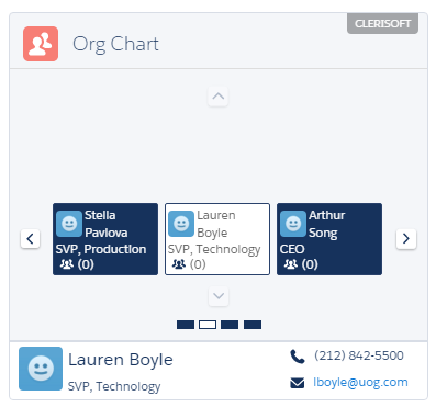
Org Charter supports the following list of properties.
1. Title : Title for the Component.
7.8.Pie Chart
Pie Chart Component facilitates plotting of aggregate data into a pie chart quickly. Pie Chart component provider finer controls to display legend.
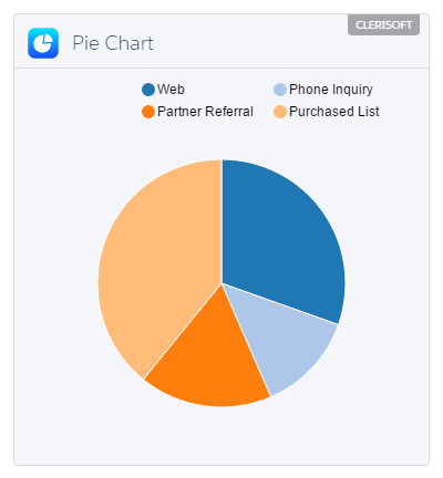
Pie Chart component supports a variety of properties for easier configurations. The following is the list of supported properties for Pie Chart component.
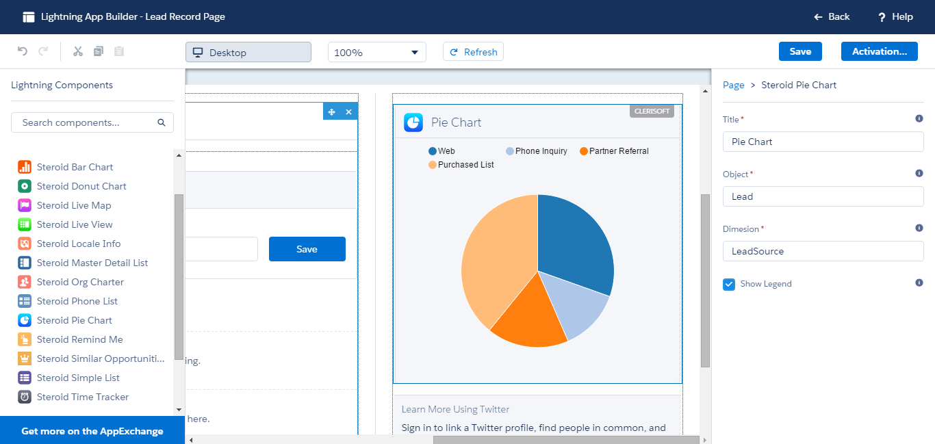
1. Title : Title for the Bar Chart (Ex: Leads By Source)
2. Object : Name of the object from which the chart is aggregated (Ex: Lead)
3. Dimension : The Aggregate property on the context object (Ex: LeadSource)
4. Show Legend: Display chart legend (True/False)
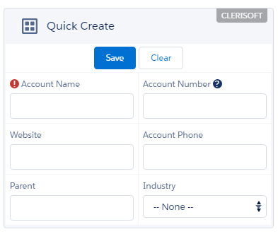
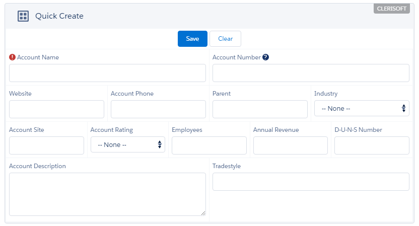
7.9.Quick Create
Quick Create Component quickly assemble a create form for any object. You could create forms for Leads, Accounts and so on. Quick Create Components supports all field types including Look Up fields and displays the Mandatory Fields and Field Help accordingly.
Quick Create Component is based on Smart Grid Technology, which allows for fluid and complex grid layouts.
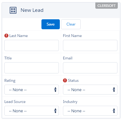
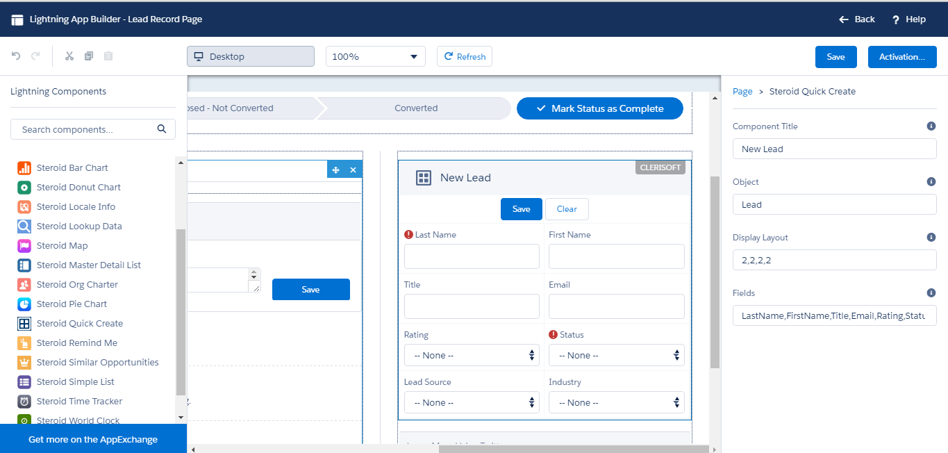
Quick Create Component has 4 properties
Component Title : Title for the component
Object : The Object for the form
Display Layout : Smart Grid Layout, a value of 2,2,2,2 creates four rows with two cells each
Fields : A comma separated list of fields for the form
7.10.Remind Me
Remind Me component provides an easy way to capture and track customer likes and dislikes. Remind Me component allows for easy updates to the data and retain data captured over a period of time.
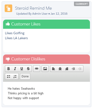
The following is the list of supported properties for Remind Me component.
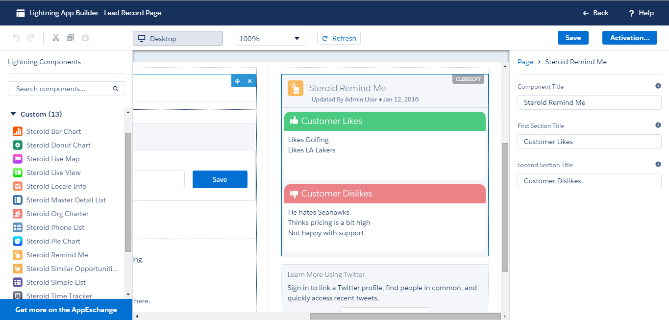
1. Component Title: Title for the component
2. First Section Title: Title for the first section (Likes, Do’s, Goods)
3. Second Section Title: Title for the second section (Dislikes, Don’ts, Bads)
7.11.Similar Opportunities
Similar Opportunities component delivers comparison intelligence with other closed opportunities that have the same Account OR Owner OR Amount.

The following is the list of supported properties for Similar Opportunities component.
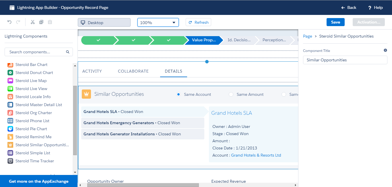
1. Title : Title for the component
7.12.Simple List
Simple List component aggregates data into multi-column table view. Simple List component features pagination controls and allows for easy configurations.
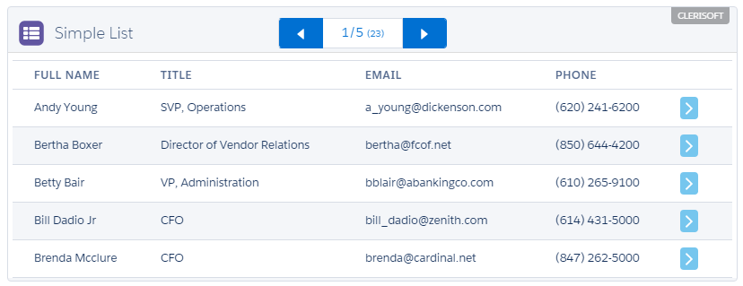
The following is the list of supported properties for Simple List component.
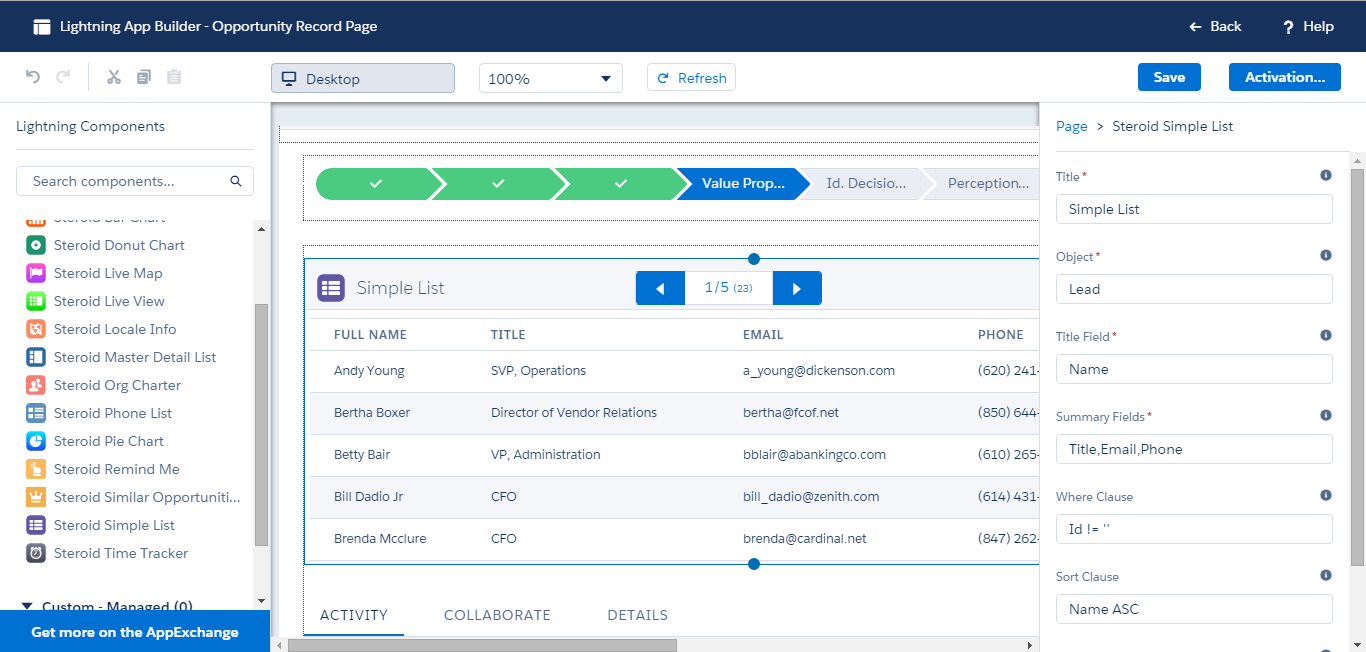
1. Title : Title for the Master Detail List (In this sample it is defined as Contact List)
2. Object : Name of the object for the list (In this sample it is defined as Contact)
3. Title Field : Name of the filed that would be listed as the title in the list view (left panel) (In this sample it is defined as Name)
4. Summary Fields : Comma separated list of field names that would be displayed in the details view (right panel) (In this sample it is defined as Phone,MobilePhone,Email,Department,MailingCity)
5. Where Clause: Supply where clause to filter data (In this sample it is defined as Id!=”)
6. Sort Clause: Supply sort clause to apply default sort order of the data (In this sample it is defined as NAME ASC)
7. # of items per page: Define the page size (In this sample it is defined as 5)
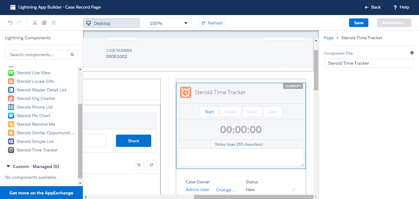
7.13.Time Tracker
Time Tracker components allows for easy tracking of time for any object. Start,Pause and save time along with comments and notes.
The following is the list of supported properties for Master Detail List component.
1. Title : Title for the component
7.14.World Clock
World Clock component lets you display Date and Time for 3 different regions. Define the Label and select appropriate timezone for each clock
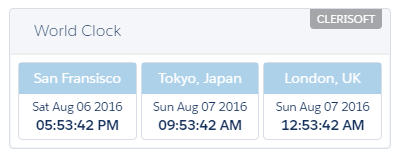
World Clock component has seven properties
Component Heading: Title for the Component
Clock 1 Timezone: Timezone for Clock 1
Clock 1 Title: Title for Clock 1
Clock 2 Timezone: Timezone for Clock 2
Clock 2 Title: Title for Clock 2
Clock 3 Timezone: Timezone for Clock 3
Clock 3 Title: Title for Clock 3